The Senior I. S. Workshops are designed to help you understand the professional skills needed to fulfill your Independent Study in Studio Art. After you graduate, you will continue to use these skills in many aspects of your future careers.
Good documentation and presentation of your artwork are essential skills that greatly impact how your art is perceived and understood by others. From print publications to your online presence, the quality of your documentation shows your level of dedication to your objectives and goals as an artist.
For additional information see the guideline document, Requirements for Senior IS in Studio Art.
Basic Concepts
Stage your work against a seamless backdrop, on a gallery pedestal, or in context to its site. Clear away any distractions, shadows, or details that draw attention away from your work. Be sure to hang 2-D work level to the floor on a clean white wall, turning off gallery lighting for individual shots to avoid hot spots.
Illuminate your work with box lights, LED panels, or natural light, adjusting highlights and shadows to create smooth and continuous levels.
Compose your subject in the frame. Allow space to breathe at the edges and document straight-forward at eye level. Watch for hot spots, shadows, and glare that create a distraction or pull the eye away from the form.
Stabilize your camera with a tripod (or with your body if a tripod is not available). Be sure to capture 3-D forms from multiple perspectives.
Explore the details and consider various angles to capture the textures, materials, and essence of the work.
Include the big picture by taking exhibit installation shots when applicable. Let the images tell the story of your exhibit so the viewer feels like they were there. Here, gallery lighting should be turned on, supplementing with additional light as needed.
Digitally Edit your best images in Adobe Lightroom or Photoshop to enhance, clean up, crop, resize, and finalize your image. Consider exposure, color temperature, white balance, levels, and curves to create consistency across all the images.
For a brief introduction to documenting your work, watch the video below by Sharon Koelblinger, Visiting Assistant Professor of Art. It was part of our 2025 workshop series.
Equipment Needed
• DSLR Camera (Nikon D7500 and D90 cameras are available in the Ebert Digital Lab)
• Tripod and Camera Plate
• Softboxes and/or LED lights (LED panel batteries hold a charge for 80 min.)
• Bubble level for hanging the artwork
Instructions
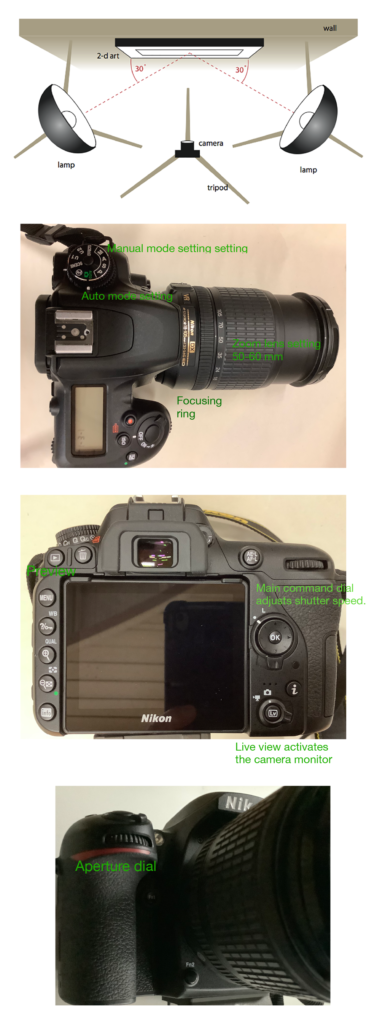
1) Position the camera at the distance afforded by the lens. D90 has a 60 mm prime (fixed focal length) lens, which minimizes distortion; it works best for photographing a single piece on the wall. D7500 has a zoom; set it at 50-60 mm.
2) Center the camera relative to the artwork and check for distortion/keystone effect. Because camera lenses distort at the edges, leave ample wall space on all four sides of the artwork.
3) Light the artwork evenly. Position the lights at 30º to the wall. If necessary, adjust the brightness. Softboxes have multiple switches to regulate brightness. LED panels have brightness and color temperature adjustment.
4) Nikon D7500 works well in Auto mode. Use Manual mode with Nikon D90. For more information on exposure settings, visit the Nikon support page.
5) For file format, choose NEF RAW and JPEG (at the highest resolution).
6) If shooting in Manual mode, for individual objects, use f-stop around 5.6 or higher with the corresponding shutter speed. Aperture and shutter speed settings are inversely related. For installation shots, use f16 to f22 to achieve the greatest depth of field.
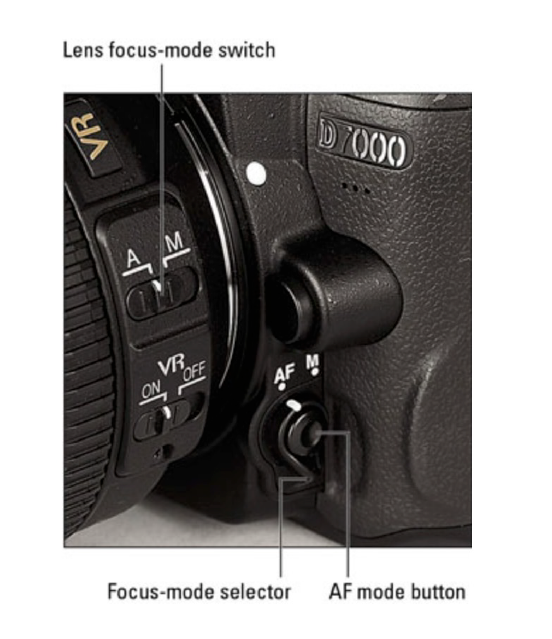
7) Use Manual or Auto Focus. Note: an image taken in Auto mode will give you a baseline for aperture and shutter speed settings that you can then start with in Manual mode.
8) Bracket your images (shoot at a few different f-stops and download to find the optimal settings. Also, make sure that the images are in focus. Note that slightly underexposed Aperture dial images can be corrected; overexposed images cannot.
9) To download images, take the SD card out of the camera and use a card reader, on the computer or external to look at the files. Navigate to the image folder and download jpegs and NEF RAW files. To check the exposure, look at jpegs.
Adjusting white balance (at the camera level)
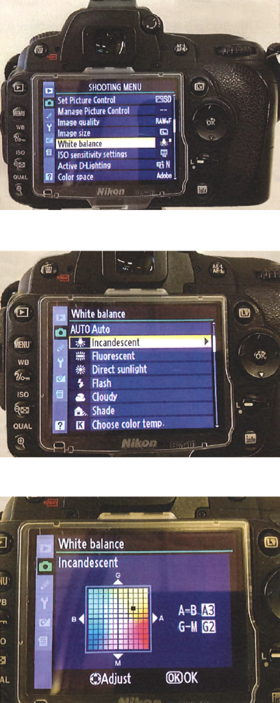
White balance can be adjusted to eliminate a color cast.
In the camera menu, set the white balance to match the lighting. You will want to take a few test images and adjust the white balance accordingly. There are several ways to set the white balance:
a) by choosing the type of light and fine-tuning the setting in the color space.
b) by setting the temperature in °K and fine-tuning the setting the color space.
Incandescent setting works for most kinds of indoor lighting.
Alternatively, you may set the white balance by choosing the color temperature.
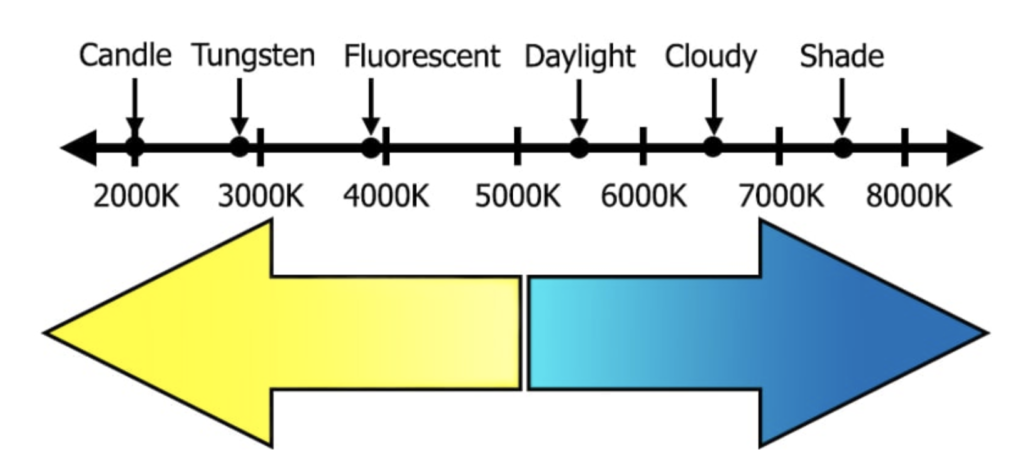
Warmer light corresponds to lower K temperatures, 2700-3500º.
For the CFL photo flood bulbs, use light temperature setting around 3700-4500°K, when the overhead lights are on. Use temperature > 5000°K, when the overhead lights are off.
For LED lights set the light temperature as shown on the LED panel.
Scanning 2D artwork such as paintings, prints, drawings, B&W, and color photos/images is an important skill to have, whether you are scanning from your sketchbook for reference images as part of your process or scanning for final documentation of your artwork.

1) Manually connect your computer to the scanner via the cable and turn on the scanner.
2) Open Epson Scan 2* – (Macintosh HD > Applications > Epson Scan 2)
3) Select the specific scanner you are using* ie: Epson V700/750
EPSON Perfection V700/750, V 850 Pro, or Expression 12000XL
*Laptops in the lab have the software and drivers installed. We recommend using the laptops and then air-drop or save your scanned files to OneDrive. If you prefer to use your own computer, you will need to download the Epson Scan 2 software making sure to include the specific scanner model driver that you are working with.
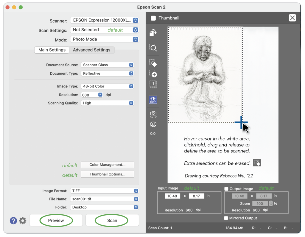
Scan Settings
• Default Setting
• Mode: Photo Mode
Main Settings
• Document Source: Scanner Glass
• Document Type: Reflective
• Image Type: 48-bit Color
• Resolution: 300dpi
• Scanning Quality: High
Specify Format and Location
• Image Format: TIFF
• File Name: BMMilligan_Spider_2023.tif
• Folder: Desktop (or somewhere specific on your hard drive)
Select Preview
This will do a quick scan for review and positioning. Uncheck the Thumbnail button. This enables you to select (marquee) the image the way that you want, by selecting the entire image or a small portion of the image. Once selected, Epson Scan will calculate the size of the image. You can also select more than one image on the glass at a time.
Select Scan
Listen for the laser head to do a complete scan and come to rest. Then check your folder and file to see that your scans are as you expected and in the correct location.
Resolution General Guidelines
Think about your final output or end use.
• 300 for same size photos
• 600 for photos you intend to enlarge 200%
• 600 for same size line drawings
• 1200 for line work you intend to enlarge 200%
• 2400 for 35mm slides you intend to enlarge 800%
Post Editing All adjustments orientation, size, rotation, cropping, white balance, exposure, contrast, and color correction should be made in Adobe Photoshop or Lightroom.
Post Editing
All adjustments: orientation, size, rotation, cropping, white balance, exposure, contrast, and color correction should be made in Adobe Photoshop or Lightroom.
Universal Editing Functions
Here are a few universal image editing functions that you will use to prepare your images for application to graduate school, submission for exhibitions, competitions, publishing, and portfolio reviews as well as for your Senior I.S exhibition posters and announcements.
Crop: Use this tool to trim away excess image or background that is unnecessary to describe your artwork. Consider if the edges are an important aspect of your work or do they detract from it.
Resize: This allows you to set image size and resolution. Resize your images to meet the requirements for submission.
Brightness & Contrast: Use with caution as these tools can ruin an otherwise acceptable image. Your monitor may not be very accurate; if you have the ability to check numeric values of RGB (red, green and blue) be sure that your image highlights don’t exceed 245 and that your shadows don’t go below 15 for each of the colors.
Image Size and Resolution: Check the specific requirements for the images you are submitting. Be sure not to submit an incorrect size, resolution, or file format. Some general rules of thumb for resolution are as follows:
• Professional printing and archiving of your images : 300 dpi
• Social media, PowerPoint, or digital screen presentations: 72 dpi
File Format: The most common are JPEG and TIF. Use these to be safe as they are accepted and opened by most computers and applications. JPEG is the most common as it requires the least amount of disk space and can be shared the most easily. TIF files are a good format for a master archive of your work.
Adobe Lightroom Classic* and Adobe Photoshop are the recommended programs for digital editing. They both have all the tools you need to do lens, color, and exposure corrections, adjust brightness and contrast, and crop, resize, and save your images to the correct format for submission.
*Be sure to use the correct Lightroom product. Lightroom is a cloud-based photo service. We recommend Lightroom Classic– the desktop-focused digital photography product.
Adobe Lightroom Classic (LRC) Methods
1) Import Images: (Library Module > Import) This will open the Import Dialog Box.
2) Locate the images you want to import in Lightroom. Import directly from the camera or from a folder on your desktop. If you cannot see your images, make sure to check the Subfolders. You can scroll down to look through your images.
3) Determine which images to bring over. Add images just as they are. Or you can select the images and turn on the loop view to get a closer look to determine if you really want to import the image. Then you can change it back to grid view.
4) File Handling – Make sure your build previews is set to Standard and the following boxes are checked.
• Build Smart Previews
• Don’t Import Suspected Duplicates
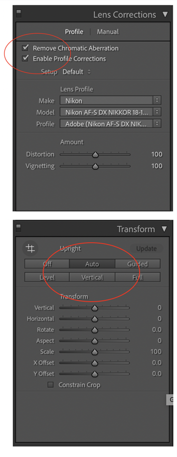
LR Lens Correction
Open the Lens Correction Panel in the Develop Module. LR has a database of different cameras and lenses and will detect your camera and lens combo and then make any needed corrections. This fixes common lens distortion issues. Sometimes when shooting with a wider angle you might get some warping or darkening on the edges. (Photoshop has a similar tool)
Make sure to check both boxes:
• Remove Chromatic Aberration (color fringing) – If you zoom in on an image and look closely, sometimes you can see red and green. This happens when colors are incorrectly refracted (bent) by the lens and results in a mismatch at the focal point (often at an edge) where the colors do not combine as they should.
• Check Enable Profile Corrections – This automatically removes distortion. You can also fine-tune it by playing around with the distortion and vignette sliders.
Transform Panel – The Auto button corrects various lens distortion problems, such as distortion, vertical, etc.
LR Color Temperature, White Balance, and Exposure
Correct Color Temperature: There are different color temperatures. Some are cool and some are warm, like a room that is lit with candlelight. Finding the correct color temperature is sometimes about correcting a colorcast or making a subjective change to the way that the color appears. The White Balance Tool in the Develop Module can help remove all the grime from the photo. Wherever you hover over, it gives you a preview of what the white balance would be if you were to click. You can view the before and after by tapping the backslash key “\”. When you are using this tool, you are looking for an area that is neutral white or gray, but not too bright or too dark. You are looking for something in the middle. Play around with your image with the White Balance Tool. You can always reset your image by clicking on the menu and choosing “As Shot”. You can also go to your temperature slider to bring the color cast out more. NOTE: You can also save your modification as a Preset.
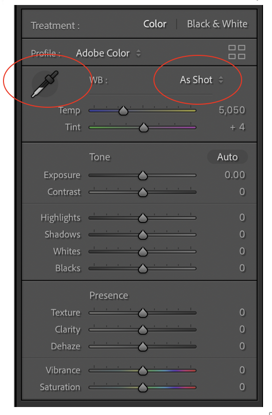
Correct Exposure: Work with the sliders in each of the areas below.
• Exposure – allows you to make dramatic changes, almost everywhere. You can brighten or darken an image in huge ways
• Contrast – drag it to the right for more contrast and to the left for less contrast.
• Highlights – have to do with the brighter areas and recovering detail lost in overexposure.
• Whites – are like highlights but are more subtle
• Shadows – you can darken or brighten the shadow area
• Blacks – allows you to work with the deepest dark tones.
First press the Auto Button. This will auto-correct the image and for the most part, it does a good job. Then fine-tune to add more adjustments based on the image you are working with.
LR Crop and Resize
Crop & Straighten – Aspect Ratio can be locked or unlocked.
Unlocked –We can crop in a free-form way.
Locked – Cropping will be fixed
Once you click the done button, you can undo what you have done by clicking on the crop tool again, and it will undo it.
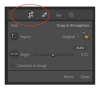
Select the Straighten Tool and click and drag along the line that you think should be straight. When you let go it will straighten it according to your line. You can also use the slider by adjusting it back and forth to rotate the image. We can kind of guess to try to figure out how straight we want our line.
Straighten automatically by holding down the shift key and double click on the word angle. This will automatically try to straighten the image for you.
NOTE: Overlay – Press the “O” key to crop with the various overlay choices
LR Resizing
While Lightroom has a resizing function in the Export dialog box, We recommend using Photoshop for resizing your images. Access from Lightroom (Photo > Edit In > Edit in Adobe PS) or export your images and finalize in Photoshop. The Art Department Portfolio submission requires that digital images be in jpg format with a resolution of 300 ppi (pixels per inch) and 1280 pixels (4.25 inches) on the longest side.
NOTE: The export preferences in Lightroom Classic may default to a lower resolution than you intend. be sure to check all the settings upon export of your images.
Adobe Photoshop (PS) Methods
1) Collect Images: place all images you are working with together in one folder. Open several at a time so that you can compare as needed.
2) Color Settings: Edit Menu > Color Settings
• For most print uses, including image manipulation and printing on inkjet/pigment printers select ProPhoto RGB or Adobe RGB (1998) color space.
• For computer screen uses and other digital devices, like tablets and smartphones the most appropriate color space for computer screens and other digital devices, like tablets and smartphones is sRGB. This RGB color space was developed by Microsoft and HP for digital use.
PS Color Correction
Photoshop offers many tools for adjusting color and modifying image gamma or contrast. The color correction tools are located in the Image/Adjustments menu, and most are also available as adjustment layers, Layer/New Adjustment Layer: Levels, Curves, Hue/Saturation, Channel Mixer, Brightness/Contrast, and Shadow/Highlight. When working with color correction tools, it is very helpful to have the Info and Color Palette, visible on the screen. These are located in the Window Menu and must be checked to turn visibility on. When adjusting a digital image, you usually want to make only a few changes to the original file (called Global Adjustment) or modify the file using adjustment layers, so you have flexibility in your decisions. Otherwise, each file modification changes the original data, and too many changes can eventually degrade the quality of the data. Therefore, you don’t constantly want to go from one color correction tool to the next frantically trying to get the effect you need. You want to use these tools intelligently, knowing what each tool is good for and keeping the total number of uses to the minimum. If you do your changes using adjustment layers, the actual pixels do not change until the image is flattened. Adjustment layers allow you to go back and change the color repeatedly without suffering from the cumulative degrading effect on the digital values. For our purposes, you will need to make global color correction and flatten the image.
PS Global Color adjustments
Levels and Curves – The most powerful color correction tools! Levels & Curves tools have the broadest range of capabilities of any of the color correction tools. When you color-correct an image from its original scan, you want to do it in a particular order. The first step is to do global/overall color correction; that is, correct the complete image without any selections. Levels is the best tool to use because it gives you a histogram of the data in the image as well as a quick way to pinpoint the lightest and darkest values of your images. You use the Levels tool to correct scanning problems, adjust image exposure (highlight and shadow values), and adjust the overall brightness, contrast, and color balance. You can toggle the preview button off and on to see the changes to your document. By pressing OK you have just made all the changes in one step. Curves enables you to do all the same adjustments that Levels does plus more specific adjustments in particular image data ranges. The Curves tool provides a curve diagram with a horizontal axis that represents the original image values with blacks and shadows on the left and whites and highlights on the right. When the curve is a straight diagonal, the image has not been changed. Moving the curve down in the middle darkens the image and moving it upward lightens the values. Curves’ advantage is that it allows you to independently modify specific portions of the image’s tonal range in different ways with more flexibility and Levels.
Photo Filter – This image adjustment makes it easy to add a color tint to an image. We can choose from presets that recreate the look of traditional, real-world color filters, or we can choose our own colors using the Color Picker.
Hue/Saturation – The Hue and Saturation tool allows you to increase the saturation of all the colors, change the hue of the image, and alter the lightness by sliding the sliders back and forth. This tool also allows you to change a file to a monochromatic image by selecting colorize.
Shadow/Highlight – With this tool you have an “automatic adjustment.” Shadow/Highlight is set by default to correct for shadows obscuring a backlit subject. But most of the time the automatic adjustment is too strong, and you must dial it down. If you click show more options, it expands the dialog box and becomes handy for quick corrections. Best results are achieved by setting the slider first with the default 50% for both Amount and Tonal Width. Get the best look you can and then adjust the Tonal Width slider to select the range of values within your radius setting that is to be adjusted. Finally, tweak the Amount slider. You may find that you need to move between the Tonal Width and Amount sliders, adjusting back and forth.
Brightness/Contrast – Another tool to adjust the brightness and contrast of your image other than the Levels and/or Curves is the Brightness/Contrast tool. This tool is more of an entry-level tool. Most professionals use Levels and Curves because it allows an adjustment of the color balance and the highlight/shadow values at the same time. The only time you might need to use Brightness/Contrast is when you don’t need to make any color adjustments and need only a subtle brightness or contrast adjustment.
Once you are finished making these Global Adjustments you must flatten your image Layer/Flatten Image (if you performed these adjustments on layers) and convert it to an 8 bits per channel, which is located under Image/Mode
PS Crop and Resize (option 1)
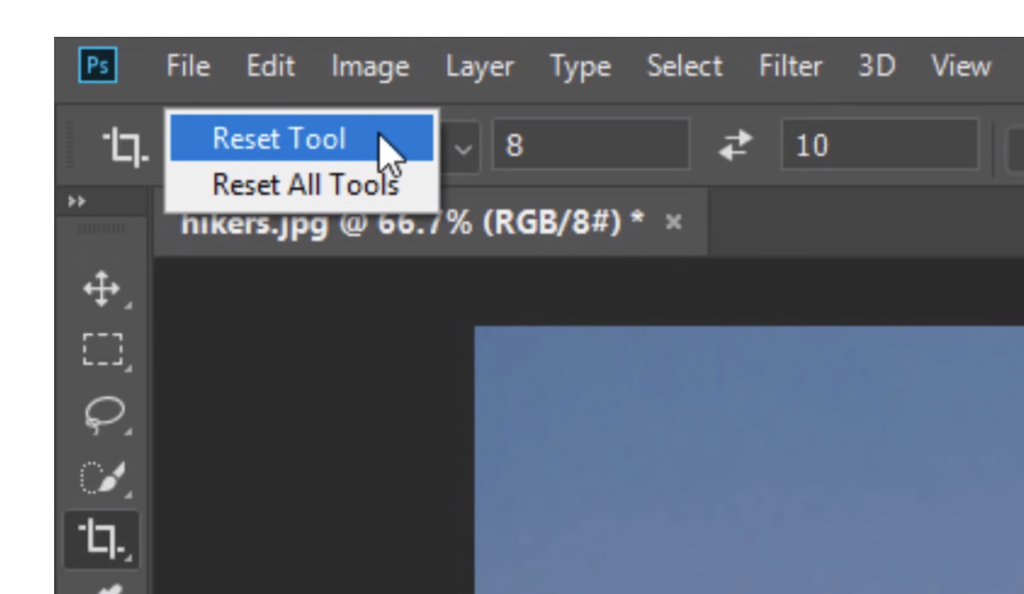
1) Select the crop tool in your toolbar. Right-click on the tool to Reset Tool. This will clear any previous settings and return the tool to Ratio. Now, crop your image to the desired visual finish. Double-click inside the crop grid or hit enter to apply the crop selection.
2) Open the Image Size Dialog box: (Image > Image Size)
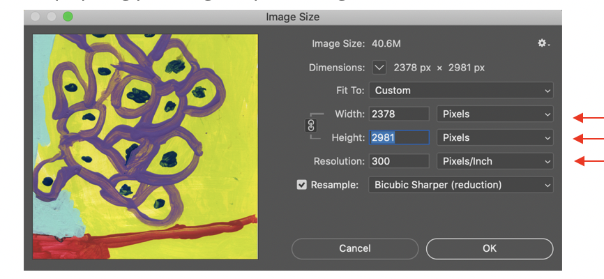
3) Dimensions: In the Image Size dialog box, you’ll see the current dimensions of your image in pixels. Take note of the width and height of your image, as well as the resolution. Pay attention to the image submission requirements for each organization. The Senior IS Digital Portfolio submission requirements are as followed. All digital images must be in jpg format with a resolution of 300 ppi (pixels per inch) and 1280 pixels (4.25 inches) on the longest side. If you are preparing your image for print, change the dimensions to inches.
4) Change the size of the image: To resize the image, change either the width, height, or both. You can also change the resolution of the image. Keep in mind that changing the resolution will affect the size of the image. For example, if you increase the resolution, the image will become smaller, and if you decrease the resolution, the image will become larger.
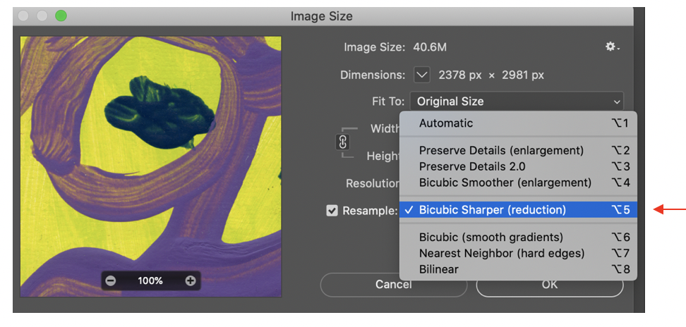
5) Interpolation: When you resize an image, you need to choose an interpolation method. This determines how the pixels in the image are resampled to create a new, larger, or smaller image. In general, “Bicubic Smoother” is a good choice for images that are being resized up, and “Bicubic Sharper” is a good choice for images that are being resized down.
6) Apply Changes: When you’re satisfied with the changes, click on the “OK” button. This will apply the changes and close the Image Size dialog box.
6) Save the image: Finally, save the resized image by going to the “File” menu, selecting “Save As”, choosing the format you want to save it in, and giving it a new name.
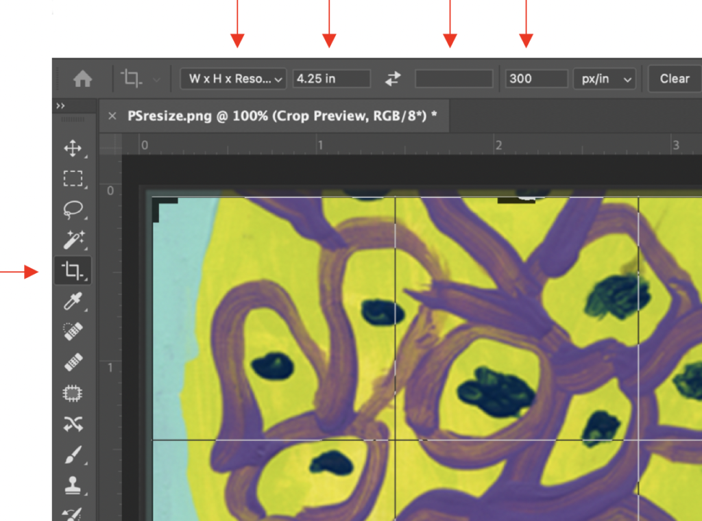
PS Crop and Resize (Option 2)
Use the crop tool set to W x H x Resolution to define the desired output.
1) Set crop as desired.
2) Set the type of crop to W x H x Resolution
3) Specify 6 inches or 1800 pixels on the longest edge (either width or height)
4) Leave the other dimension blank as it will be established automatically in proportion to the defined dimension.
5) Set Resolution to 300ppi.
6) Now, crop your image to the desired visual finish. Double-click inside the crop grid or hit enter to apply the crop selection.
7) Save the image: Finally, save the resized image by going to the “File” menu, selecting “Save As”, choosing the format you want to save it in, and giving it a new name.
Keep your files organized
As an artist, you may submit some of the same digital images of your work to different organizations for exhibitions, competitions, publishing and/or portfolio reviews. Organize your images by categorizing them in folders by date of completion, medium or whatever works best for you. Follow a consistent naming convention for your image files. Some suggestions are listed below:
• Keep an uncompressed version (TIFF format) of your files on your hard drive or archived on an external drive.
• If you want your work to be quickly and easily shared with your identification, save your files as such: LastNameFirstInitial_CompletionYearAbbreviatedTitle.jpg (Example: MilliganB_2020DreamFlight.jpg)
• Keep the number of characters in a file name to 30 or less.
• Avoid using spaces as they can cause problems in databases and on the web.
• Capitalizing the first letter of each word allows for easier reading.
• Underscores and dashes are the only permitted special characters.
• When submitting artwork on a flash drive or through email, include an Inventory/ image description sheet with corresponding numbers to your images.
Save your files in a folder that is clearly labeled and easy to find. Double-check once you save your files to ensure all the images are there.
More about file formats
TIF (.tif)
The recommended format for highest quality scans. The TIFF format is a lossless format ideal for archiving your work. (Lossless Compression)
PNG (.PNG)
PNGs are smaller than TIFFs and higher quality than JPEGs. They are also larger files than JPEGs. The are most often used when you want a transparent background.
(Lossless compression)
JPEG (.jpg)
An image format that is used in any situation but especially when it’s important to have a small file, for example web images. Note, the higher the compression the lower the image quality.
(Lossy compression)
PDF (.pdf)
Portable Document Format is also good for transferring files. It is most often used for documents that have text or text and images. It is especially good for sharing a portfolio. You can save multi-page documents in one PDF file as well as combine individual pdfs into one using Adobe Acrobat. (pdfs support both lossy and lossless compression and are defined within the compression settings)
Lossless and lossy file compression
Lossless compression retains and restores all of the original data in a file after it is uncompressed and no matter how many times it is opened and closed. Lossy is an irreversible compression that reduces file size by permanently eliminating certain (especially redundant) information.
Announce your exhibit
There are several key elements that can make an exhibition announcement poster and postcard effective and eye-catching. Here are some of the most important things to consider:
Attention-grabbing visuals: The imagery you use on your poster or postcard should be visually striking and compelling. This could be a photograph of one of the artworks that will be on display, an illustration that captures the theme of the exhibition, or a bold graphic design that stands out.
Clear and concise information: While the visuals are important, it’s also essential that the text on your poster or postcard is easy to read and understand. Include the title of the exhibition, the name of the artist or artists, the dates and times of the exhibition, and the location. Be sure to use a font size and style that is legible, and consider breaking up the text into smaller chunks for easier reading.
Consistency with branding: If your exhibition is part of a larger organization or series of events, it’s important to make sure your poster and postcard are consistent with the overall branding of the organization. This can help build recognition and create a cohesive visual identity for the event.
Attention to detail: Make sure your poster and postcard are well-designed and printed on high-quality materials. Small details like color accuracy and paper quality can make a big difference in how your event is perceived.
Unique and memorable design: Finally, try to create a design that is memorable and stands out from other exhibition announcements. This could be through the use of unusual materials or printing techniques, a creative layout, or a bold color scheme. Don’t be afraid to take risks and experiment with new ideas to create a design that truly captures the spirit of your exhibition.
Visual hierarchy in layout and design refers to the arrangement of visual elements in a way that guides the viewer’s eye through the content in order of importance. By using visual cues such as size, color, contrast, alignment, and spacing, designers can create a hierarchy of information that emphasizes the most important content and makes it easy for viewers to understand and navigate the design.
For example, headlines and titles can be made larger and bolder than the body text, making them stand out and conveying their significance. Images can also be used to create a visual hierarchy, with larger and more prominent images indicating the main subject or topic of the design. Similarly, contrasting colors and font styles can be used to highlight important information, such as calls to action or key points.
Overall, visual hierarchy is an important principle in layout and design as it helps to communicate information effectively and efficiently, making it easy for viewers to navigate and understand the content.
Design your Posters and Postcards
The Senior I.S. Exhibits in MacKenzie Gallery provide the opportunity to design and print your own Posters and Postcards to announce your exhibit to friends, family, the campus community, and the public.
Each senior can print a preset amount of one-sided Posters and 2-sided Announcement cards. (quantities may vary)
As you plan your design, consider the key strategies detailed in The Portfolio and Exhibit Announcement – Overview Tabs. These fundamental design principles will help to clarify your message and design.
Each senior can print a preset amount of one-sided Posters and 2-sided Announcement cards. (quantities may vary)
Come to the Ebert Digital Lab 2 weeks prior to your exhibits to discuss your promotional materials.
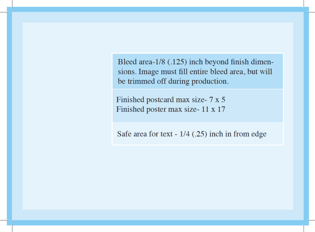
Give yourself plenty of time to design and build the documents. It typically takes from 2-5 hours, depending on your familiarity with the programs. InDesign is highly recommended for the layout for crisp clean text. Linked images must be 300 ppi at finish size. Text must be in the safe zone ¼ inch from trim, and the design must allow 1/8″ extra image area for the bleed (which gets trimmed off). Final PDFs must have trim marks.
In the Lab, you can use standard templates or customize your layout, and learn more about margins and bleeds. Once the layouts are complete you will submit your digital files through the online printing portal in the Ebert Digital Lab.
Your finished layouts can also be exported as 72dpi jpgs for online use.
Recommended Programs: Adobe InDesign and Adobe Photoshop
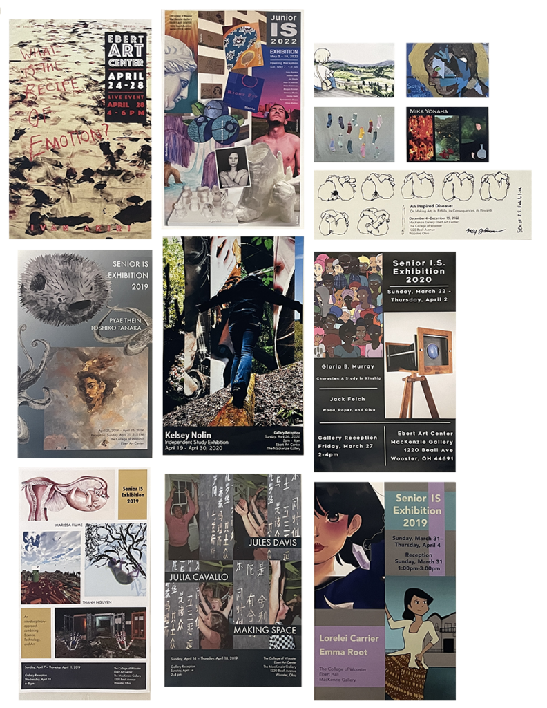
Below are samples from previous Senior I.S. students. More samples are available in the lab.
Your creative intentions set to words
Understand the purpose: An artist statement is a brief written statement that accompanies an artwork, explaining the artist’s creative intentions and contextualizing the work for the viewer.
Reflect: Think about what inspired you to create the artwork, what ideas or emotions you were trying to convey, and how you approached the creative process.
Identify key themes or ideas: Consider what the artwork is about and what message you want to convey through it.
Use clear, concise language: Avoid using technical jargon or complex language that may confuse the reader. Keep your language simple and to the point.
Be specific: Use concrete examples from your artwork to illustrate your points. Describe the materials and techniques you used and explain how they contribute to the overall effect of the piece.
Edit and revise: Once you have a draft, read it over and revise it as needed. Consider having someone else read it to provide feedback.
Consider your audience: Write ‘as if’ your work is being exhibited in a gallery. Your writing style should be slightly more formal and polished than if you were writing for a personal blog or social media.
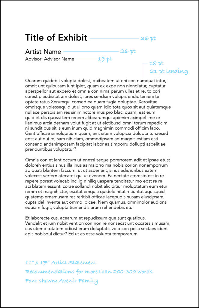
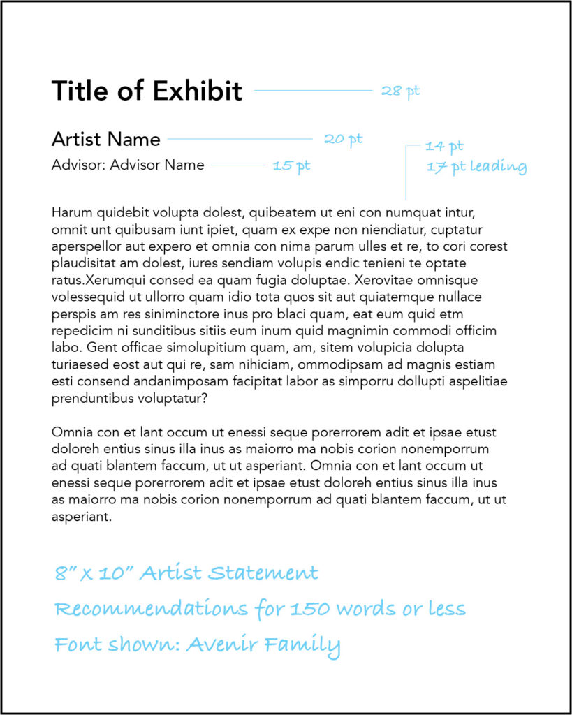
Recommended Programs: Adobe InDesign or Microsoft Word. Indesign Templates are available in the Digital Lab.
Suggested Layout below:
Establish a label hierarchy
When writing labels for exhibitions, consider the varied knowledge levels of your audience, and use clear and concise language that avoids jargon. Provide contextual significance about the object, keep the order of information consistent, and include key things of interest about the artwork. Aim for a 70-80 word count on individual artwork labels and 100-200 words for introductory panels, as visitors generally spend 10 seconds reading each label. A label hierarchy, using visual cues or symbols, can help break up information into digestible sections. Consistency in font, text size, spacing, and type helps audiences digest the information. Use black text on white, cream or clear backgrounds for legibility. Consider labeling needs for diverse audiences, such as children, those with accessibility issues, and varied language groups.
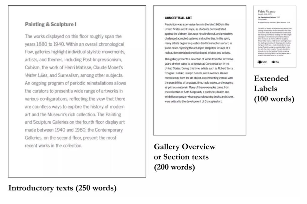
The placement and location of labels should build a narrative or develop a learning experience for the audience. Technology can provide new ways to communicate exhibition information, but didactic technology should not dominate over the artworks they reference.
Extended labels next to specific artworks include the standard artwork information plus a brief paragraph that gives insight into a specific work. The content may vary and could include more information about the artistic process, the artist’s inspiration and intent, or speak directly about themes or symbols in the artwork.
See your advisor for information on the materials and tools needed to create your labels.
Recommended Programs: Adobe InDesign or Microsoft Word
The art portfolio serves as a comprehensive collection of an artist’s work that showcases their skills, style, and creativity. The purpose of an art portfolio can vary depending on the artist’s goals and the intended audience, but some common purposes include applications for art schools, grants, residencies, and exhibition opportunities, all of which require a portfolio submission. Also, when seeking employment or freelance work, a portfolio demonstrates your skills to potential employers or clients. A strong portfolio can also be used to promote yourself and your work. In general, an art portfolio serves as a visual representation of an artist’s skills and style, and can help you to showcase your work to a wider audience.
Key Strategies
There are several visual communication strategies for layout and design that can make your communication materials more effective and engaging. Here are a few key strategies to keep in mind:
Balance: Distributing visual elements (e.g. text, images, whitespace) evenly throughout the layout creates a sense of stability and harmony and can help draw the viewer’s eye to key points of interest.
Contrast: Create visual interest with contrasting colors, font sizes, or text styles; also help draw attention to important information, such as headlines or calls to action.
Visual Hierarchy: Guide the viewer’s eye through your design through the use of font sizes, bold or italicized text, or varying levels of indentation. Also, the use of size, color, and contrast. prioritizing information in a design.
Consistency: Use the same style and formatting throughout to help create a cohesive look and feel, and can make your message more memorable.
Simplicity: Keep your design simple and uncluttered for the viewer to easily understand and engage with your message through use of whitespace, minimal text, and simple graphics or illustrations.
Alignment: Creating a sense of order and structure in your design helps make your communication materials more professional and easy to read.
Recommended Programs: Adobe InDesign and Adobe Photoshop
Submit your work to the official College of Wooster Art Department Digital Archive
DEADLINE for submission: 4 pm on the Monday of finals week (for 2026 it will be Tuesday, May 5)
Your Digital Archive submission fulfills a portion of your final assessment and is the official record of your Senior Independent Study Exhibition. The Archive also informs the online Senior I.S. Studio Art Portfolio.
Once completed a link to your page in the archive can act as a digital snapshot of your IS project that you may reference on your resume and share as a record of your artwork. Click on the Senior IS Studio Art Portfolio button below to see past work from previous graduates.

All Archive submissions are due by 4 pm on the Monday of finals week. Please make use of the Ebert Digital Lab to organize, edit, and AirDrop your files. (details below**)
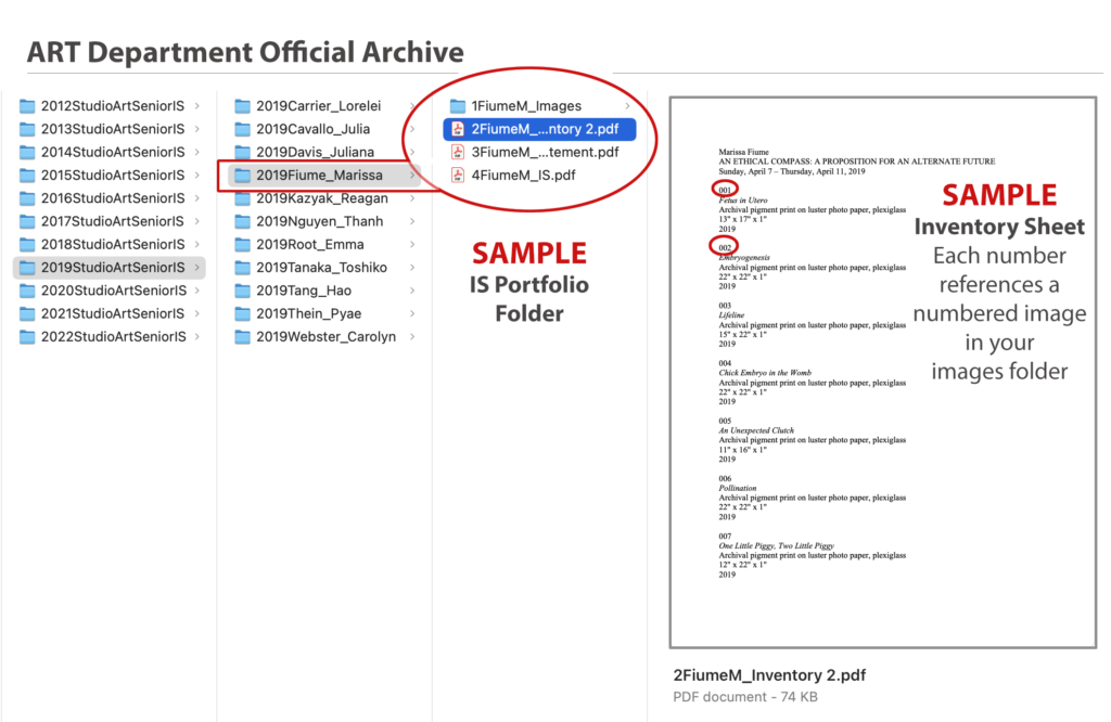
Your Digital Archive should include the following items:
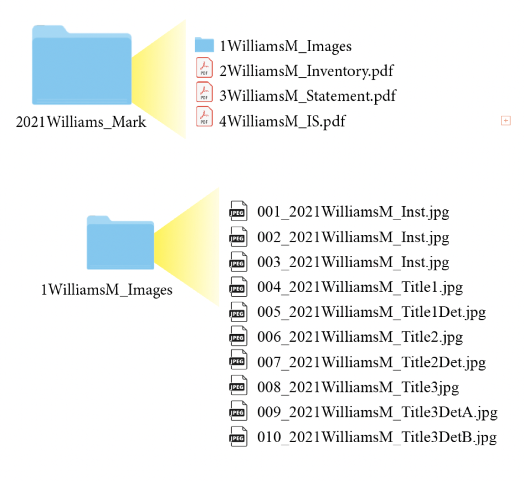
- Image Files (10-20 .jpgs or .pngs in a folder)
- Video Files (.mp4) fewer images may be submitted if primary work is video or animation)
- Image Inventory (.pdf)
- Artist Statement (.pdf)
- Thesis Paper (.pdf )
Image and or Video Files
10-20 digital images or video files that visually describe your Senior IS Exhibition.
Edit and Refine
Edits should serve to provide clarity and create consistency across all images. Visually distracting objects- outlets, exit signs should be omitted. Review tones and contrast, check white balance, remove distortion, and balance colors appropriately.
Include the following images:
• Several gallery installation shots – overview images that encompass more than one piece.
• Individual artwork or images of how a video or animation was presented.
• Detail shots to help visually describe the work – highlighting medium, texture, unique close-up features
Crop and Resize
Images should have enough negative space around them to breath but not swim. Include the edges if it is important to the finished work and photograph on a neutral background (typically the MacKenzie Gallery wall). In some cases, it may be appropriate to crop to the image edge or scan your work for final submission. In other cases a digital file of digitally created work is best. Discuss these questions with your advisor.
All digital images must be in jpg or png format with a resolution of 300 ppi (pixels per inch) and 1800 pixels (or 6 inches) on the longest side. The second dimension can float.
All video files must be submitted as .mp4 files and as discussed with your advisor for fulfillment of IS.
Naming Convention
File names should conform to the following convention:
001_YYYYLastnameFirstInitial_Title.jpg
002_YYYYLastnameFirstInitial_TitleView.jpg
YYYY is the year. Name is last name immediately followed by first name initial (WilliamM). If title is lengthy, reduce to initial word/s, and if applicable, the view should be either detail (Det) or installation (Inst). Always use leading zeroes for the piece number.
Type of Photo—- Example Title
Installation photo—- 001_2021WilliamsM_Inst.jpg
Individual artwork—- 002_2021WilliamsM_Title.jpg
Detail photo—- 003_2021WilliamsM_TitleDet.jpg
Image Inventory
The image inventory is a list that identifies each image you submit. Include your name, exhibition title, and dates of your exhibition at the top of the Image Inventory list. Submit as pdf.
Each entry on the list should be numbered and include:
001 (image reference number)
Title (italics)
Media (separate with commas, cap first item only)
Dimensions (For 2D work use: height x width, For 3D work use: height x width x depth.
For all dimensions use: straight inch marks “, not curly typographer’s quotes ”
Date of artwork (year only)
Example
001
Untitled
Inkjet prints, spray paint, sequins
22″ x 17″
2025
Artist Statement
The Artist Statement/didactic is a copy of the statement that is part of your Senior IS Exhibition.
Submit as pdf.
Senior Thesis Paper
The Thesis Paper file must contain the complete text of the paper and include all illustrations (images of your work that are featured in the IS paper and all reference images).
Note: Please proofread the text carefully and correct all typos, misspellings, and grammatical errors. Any corrections your advisor asks you to make should be reflected in the final version of your paper.
The digital copies of the Thesis Paper and Artist Statement and Image Inventory must be submitted as separate PDF Files.
IMPORTANT: Your digital archive files must be submitted by 4 pm on the Monday of finals week (OR SOONER) unless otherwise noted in Senior IS Rubric. Send via AirDrop or OneDrive to Jodi Robison: jorobison@wooster.edu. If you use OneDrive, you must allow editing permissions (not just viewing).
Visit the Senior I.S. Portfolio/Archive.