
Process
After receiving the results of a survey of department and program chairs, Ed Tech was asked to investigate the possibility of switching learning management systems (LMSs) and changes that could be made to Moodle. Ed Tech followed the following process: we considered other LMS options suggested by faculty, we did a feature comparison with Blackboard, Canvas, and D2L (Desire To Learn), we looked at what similar schools use, we asked vendors if they would be able to switch us to a new LMS by July 1, and we presented our findings to AGRAW (Advisory Group on Remote Academics at Wooster).LMS Comparison and Moodle Plugins Summary.docx At the recommendation of AGRAW, we were asked to stick with Moodle and explore plugins and themes that would expand its capabilities. At that point, we began the process of creating demo courses in Moodle to allow faculty and students to examine various themes and course formats and provide us with feedback.
We initially sought feedback from members of AGRAW and FTLs (faculty teaching liaisons) and then expanded the invitation to all faculty. Similarly, we invited Student Technology Assistants to provide student feedback before seeking feedback from AMRE (Applied Methods and Research Experiences) and ARCHers (Academic Registration and Creative Horizons). In total we received 34 responses to the feedback form with about 60 faculty and students having enrolled in one of the courses.
Results
Theme
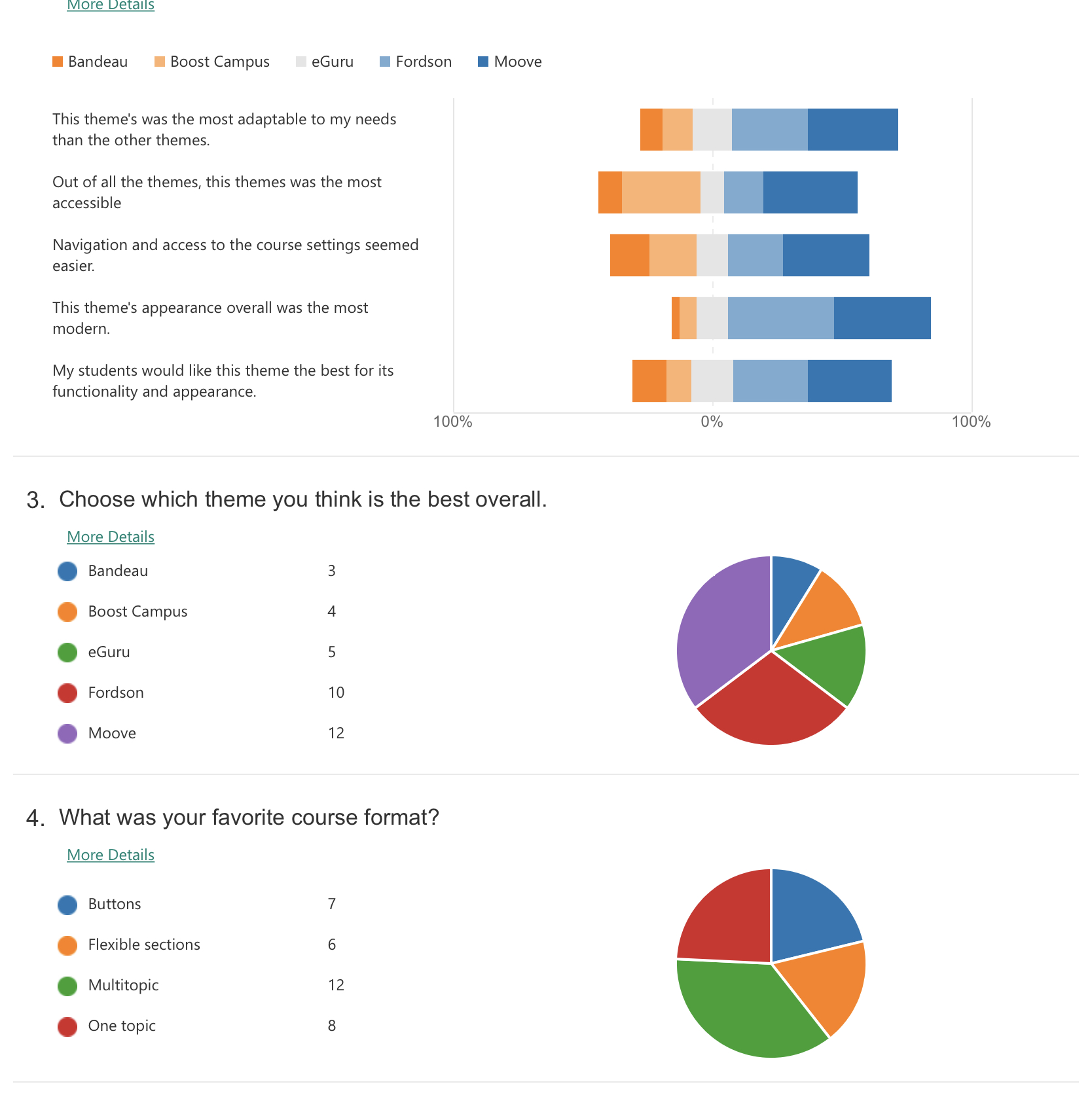
As you can see there wasn’t a strong preference for a particular theme. People tended to gravitate toward Moove and Fordson as looking and feeling more modern. Fordson pulled some of the course management features and settings to a more prominent forward-facing menu. Moove offered more clear accessibility features. In the end Moove came out ahead with 12 votes to 10 and has been set as the theme for this year.
Course format
It was clear from some of the comments that there was some confusion between course format and theme. However, what is clear in the results is a desire for a tabbed presentation of the course sections. Both Multitopic and Onetopic formats present one section at a time on the page and allow navigation via tabs at the top of the course content area. Multitopic has a clear way to organize a topic as a subtopic of another topic while Onetopic allows this but it is not as obvious.
While Multitopic received more votes, in our evaluation it displayed an issue that Onetopic did not. If a faculty member were to switch course formats from Multitopic to another course format and try to switch back to Multitopic, then the topics would no longer be organized and presented in tabs as they had been. Rather they would be listed as part of the General section. We deemed this to be a potentially frustrating behavior (especially for faculty who may not have used Moodle much). So, we have selected Onetopic as the default course format for newly created courses. Unlike the theme, faculty will be able to switch course formats among any of the nine available and so those that liked Multitopic will be able to organize their course in that way knowing its potential limitations.
Some comments that influenced our thinking:
I really liked the topical tabs, though. It makes the site a lot easier to navigate instead of endless scrolling!
Out of the five, the two that stood out for their intuitiveness were Eguru and Moove. Both of those themes were easy to follow and looked aesthetically pleasing. Moove edged ahead of the other themes for me because it allowed for organized groups and very obvious tabs.
I liked the layout of the Onetopic and Multitopic themes better than the others. The tabs allow you to navigate easily to what you need without having to sort through ALL of the content on that page. I found the background image in Fordson with Onetopic to be distracting.
Moove is nifty! It was my immediate favorite just based on look. I deeply regret the lack of one click editing mode and now that I know it exists elsewhere I can’t get behind this 100%. However, this has the solution to my second biggest pet peeve, which is the ability to hide the blocks in a drawer! And I think that one might well be more useful for students. Seems to be designed with more flexibility and accessibility explicitly in mind.
I liked the simplicity of the look of the first three (Boost, Moove, and Bandeau). I was not a huge fan of the color of Eguru, and Fordson seemed a bit busy.
Final decision
So, with this all in mind the default template will use the Moove theme (can not be changed) with the Onetopic course format (can be changed by faculty).